11 v_form_auto
Generates a form from the parameters of an SRS and runs the SRS on submit.
- loads the SRS definition with a GET request and shows one field per
param - on submit, sends the field values as a POST to
/api/{srsurl}/run.json(with?pscope={scope}whenscopeis set) - the first row of the first command prefills empty fields with matching names
Props
Required
srsurl- SRS path, for examplesrs/946- when missing, the component reads
srsurlfrom the query string, or builds it from the/form-srs/:name/:renderer?route (srs/{name}/{renderer}, default rendererauto)
- when missing, the component reads
Optional
scope- command name; shows only parameters withoutscopeor scoped to this command, and runs only this commandconfirm- (true/false) asks for confirmation before submit; default isfalsecss- CSS class of the form; defaultxd-content xd-paddingparams- object merged with the props; used when the component is opened from an SRS column or option- all keys (except
clipboard_items) are added to the query string of the GET request, so the SRS can use them as parameters, for example to prefill the form jqclipboard- name of the parameter that receives the selected rows (clipboard_items); after a successful submit the table is reloaded and the dialog is closed
- all keys (except
clipboard_items- selected rows, passed byv_srs_table
Note
In params, only srsurl and jqclipboard are fully supported. scope limits the executed command but not the visible fields, and confirm is ignored. Pass scope and confirm as props, or use an option with opts="uimenu".
Fields
The field is chosen from the parameter type:
number- number inputdate- date inputcheckbox- Yes/No dropdowntextarea- text areacodemirror- code editor- any other type - HTML input of that type, default
text
Parameter attributes used by the form:
label- field labeltitle- hint below the fieldopts="req"- required fieldcss="xd-disabled"- disabled fieldlg="false"- hidden field
UI Examples
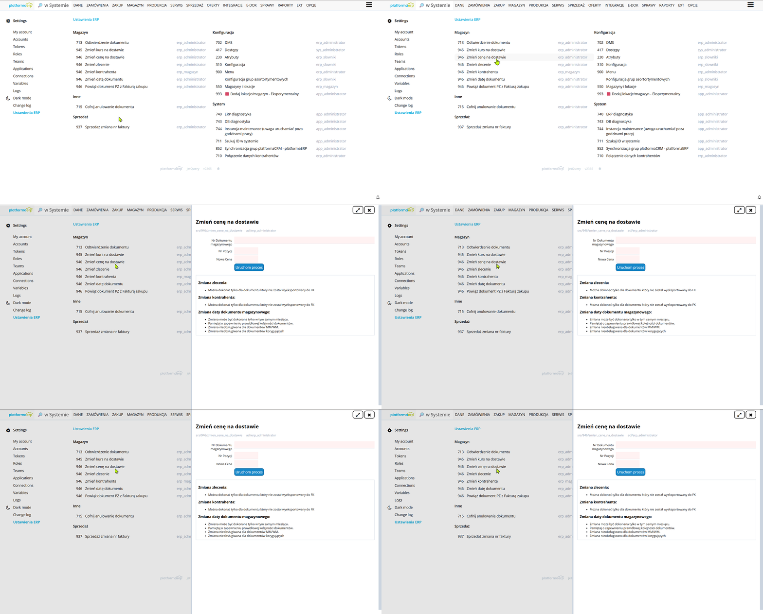
Examples
Basic html
| HTML | |
|---|---|
Html with modal
| HTML | |
|---|---|
SRS Option
| XML | |
|---|---|
SRS Column
The column value opens the form in a modal. {columnName} placeholders are replaced with the row values. See Custom component column.
| XML | |
|---|---|
The same with a link column:
| XML | |
|---|---|